Yepoda
Korean Skincare
Branding, Packaging Design, Social Media, Photography Art Direction, Unboxing Experience, Brand guidelines
The Brief
Build a skincare brand from scratch, one that blends Korean values with mindful ingredients and feels fresh, credible and fun for a European audience.
The goal? Make Yepoda the go-to name in accessible high-quality K-Beauty.
The Approach
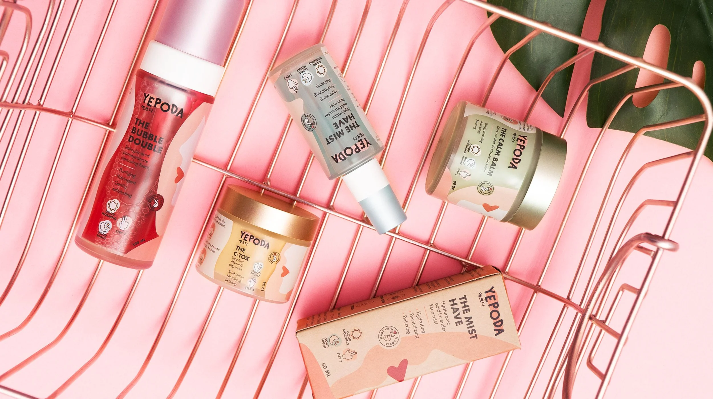
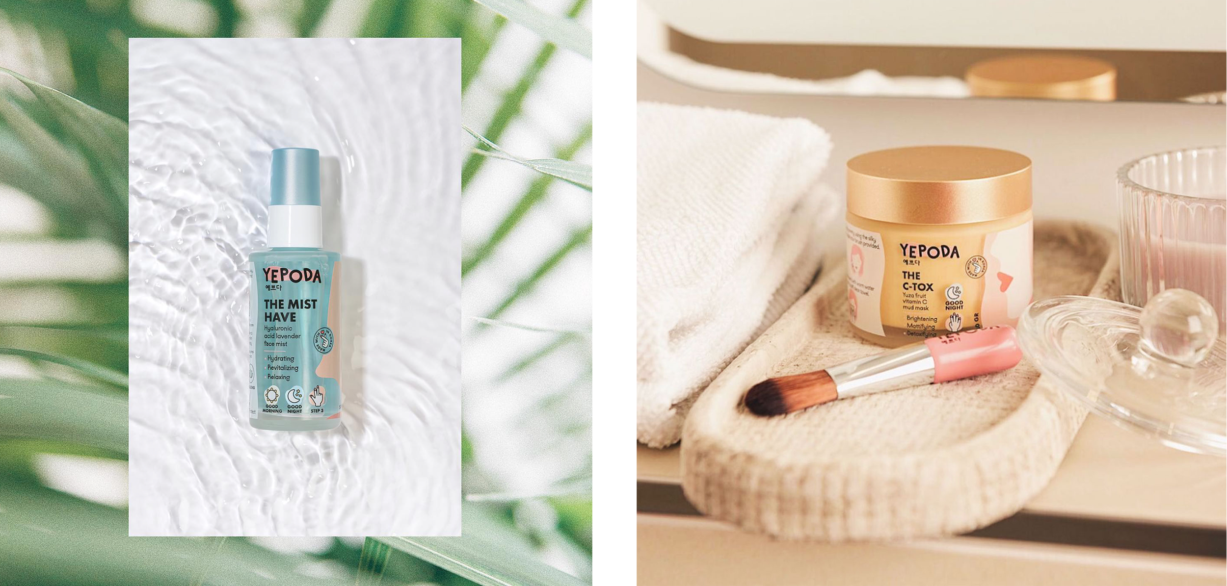
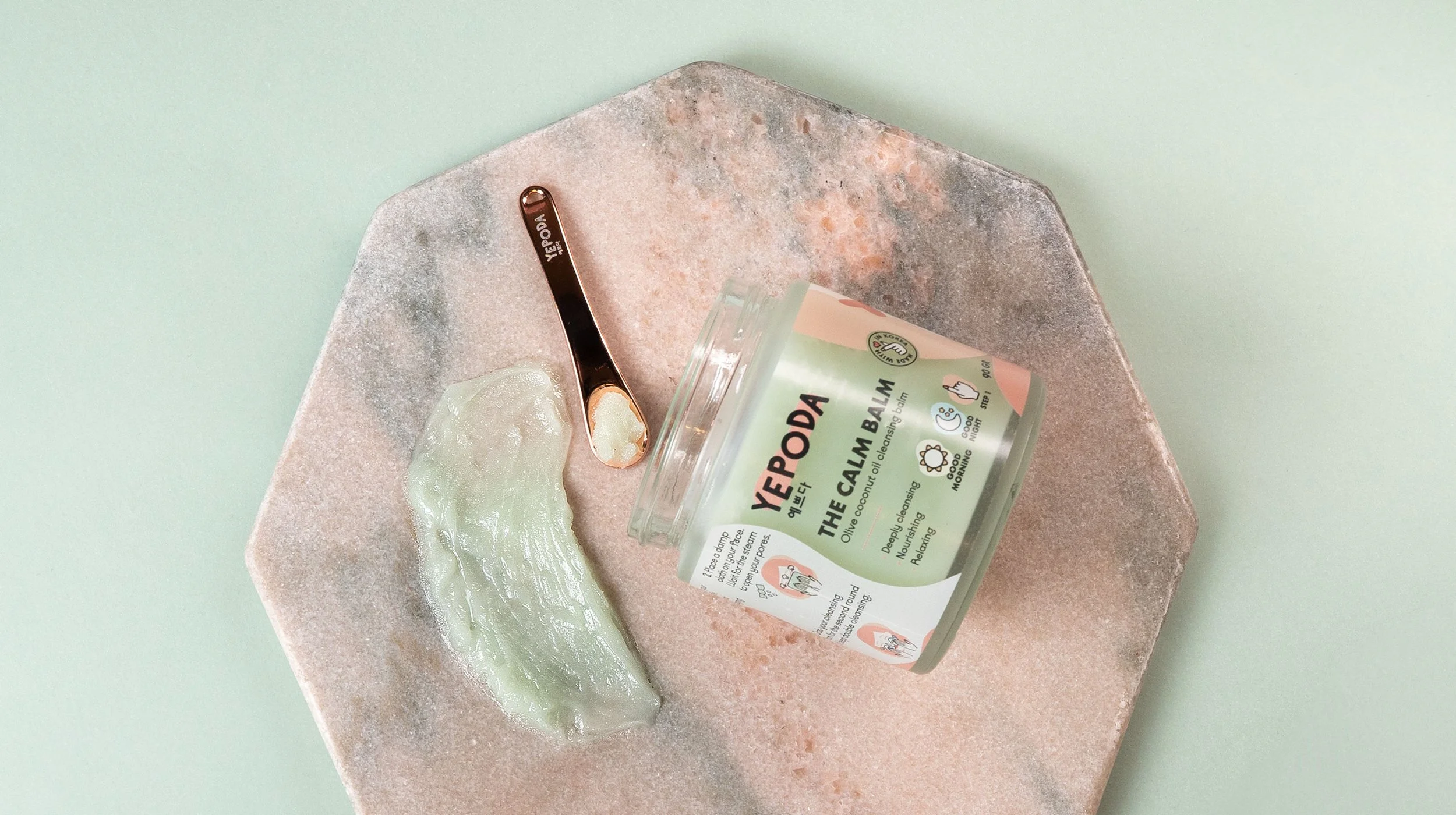
Yepoda means ‘pretty’ in Korean. We wanted the brand name to shine through the graphic style, so we created a set of abstract illustrated girls that represent each skincare range, portraying that ‘pretty’ comes in all shapes and sizes.
The focus was on making Korean skincare feel more accessible in Europe, while keeping the values front and centre: natural ingredients, mindful production, and a playful, positive feel.
What started as a new idea is now a fast-growing brand, stocked in Sephora and loved across multiple markets.
The Transformation
Yepoda launched online and quickly scaled across Europe, now in 100+ Sephora stores and a recognised name in conscious skincare.
The brand continues to grow, with a strong visual identity and clear values at its core!

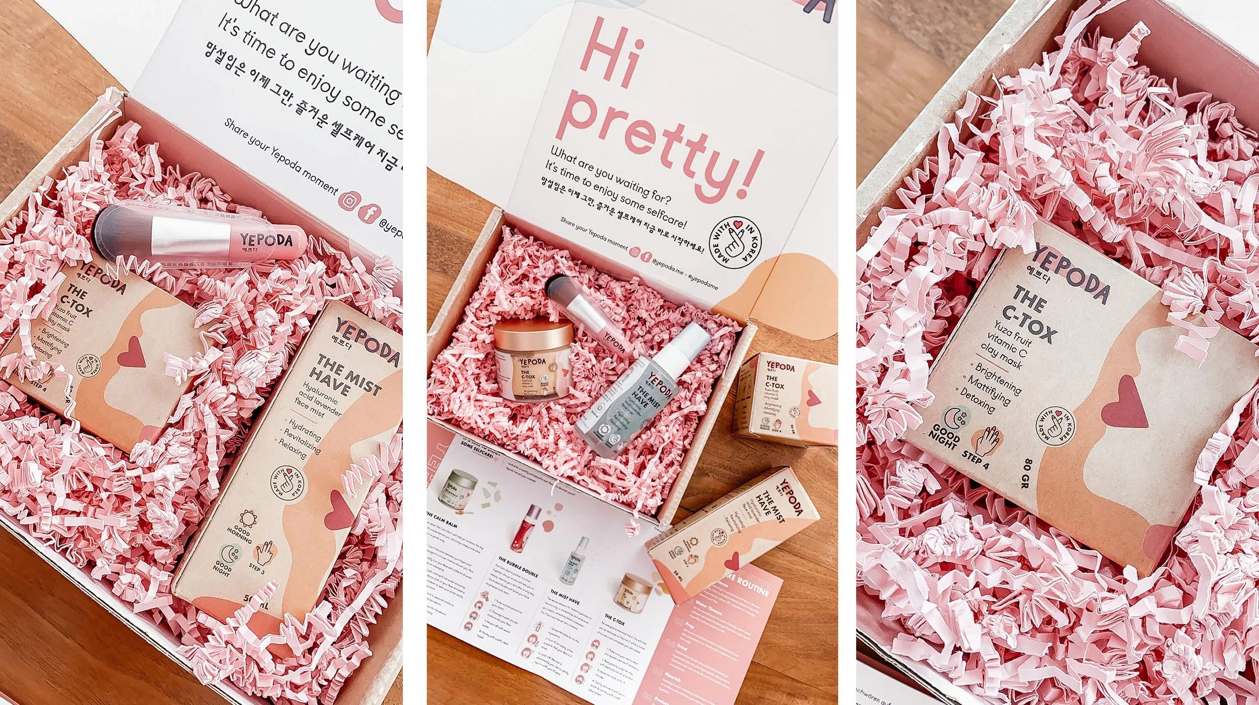
The Unboxing Experience
Before Yepoda hit retail shelves, we helped them create an experience that felt just as premium but at home.
As part of the Packed Launch, we designed a full unboxing moment: custom mailer box, leaflets, sticker sheets and thoughtful extras that made every delivery feel considered and exciting!
It gave customers a taste of what the brand stood for: carefully made, joyfully presented and full of personality.
The kind of touchpoint that builds trust and leaves a lasting impression, long before retail came into play.