Popple
Natural Cosmetic Lenses
Branding, Packaging Design, Social Media
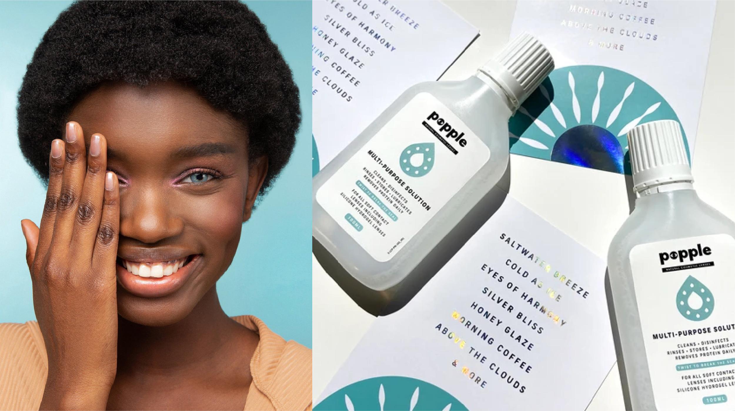
The Brief
Name, brand and package a natural contact lens product for a new start-up. The focus? Empower people to change their eye colour as easily (and confidently) as changing an outfit.
The goal? Make a bold, beauty-led statement—without losing sight of the natural story behind it.
The Approach
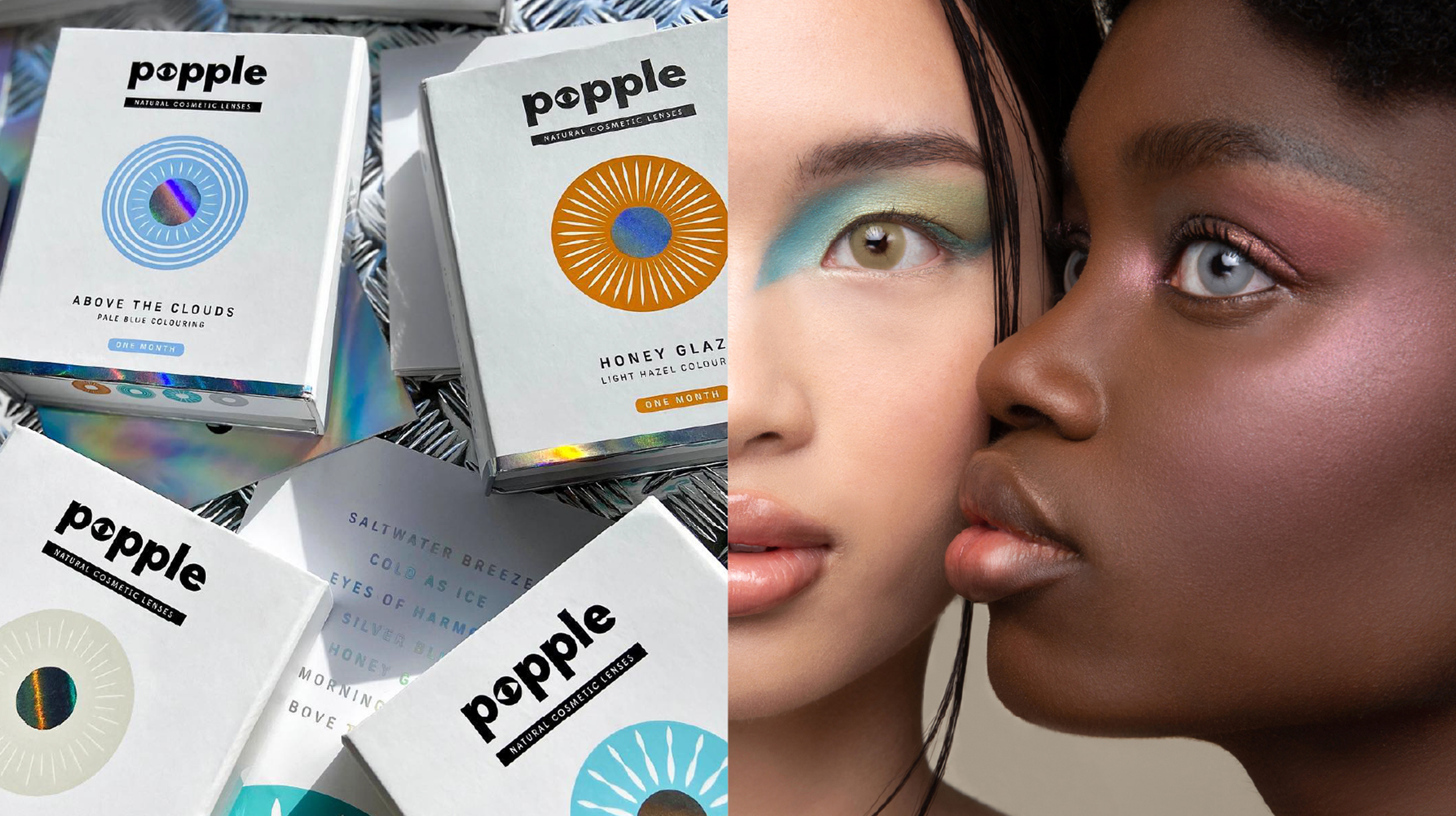
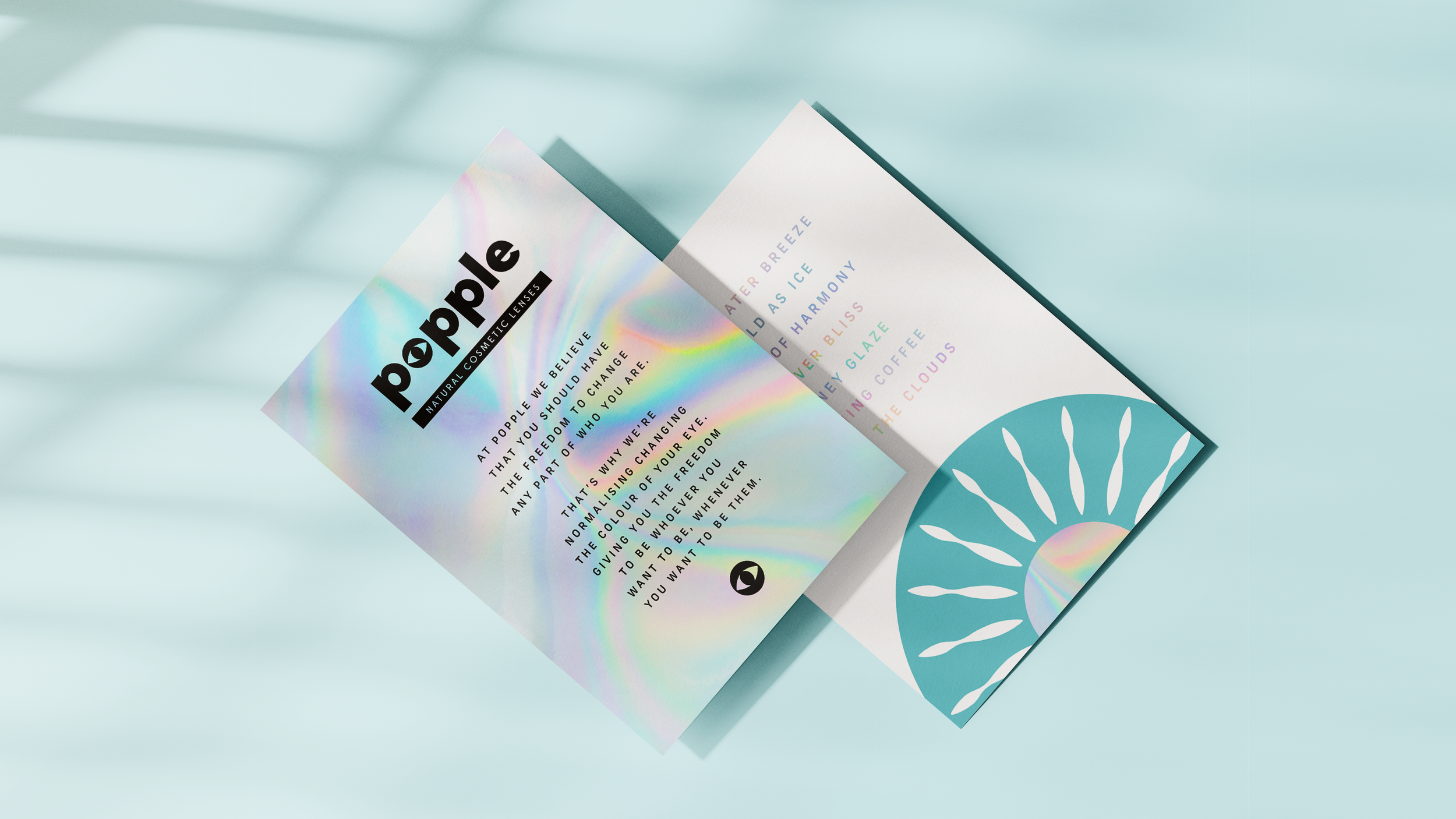
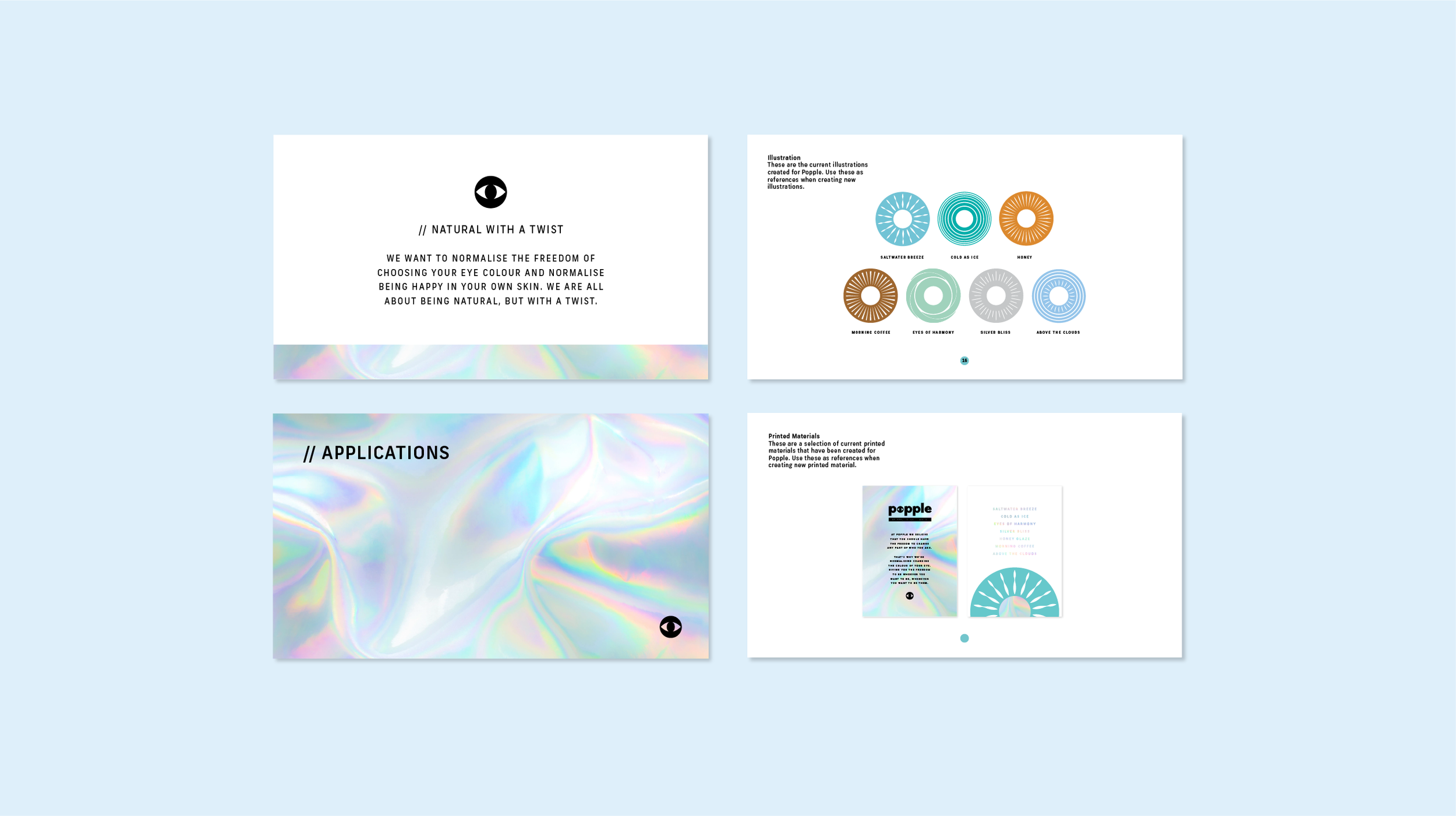
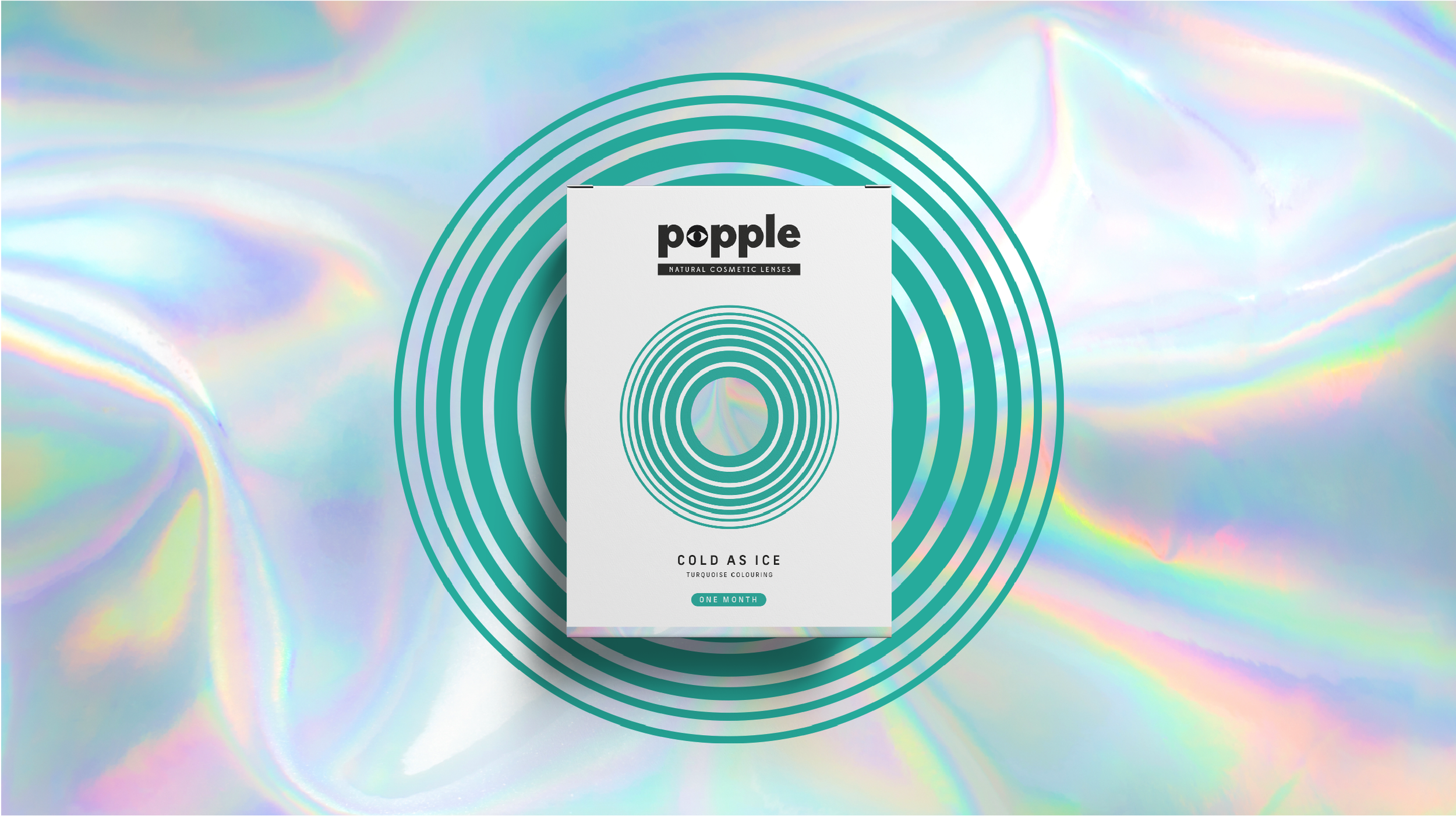
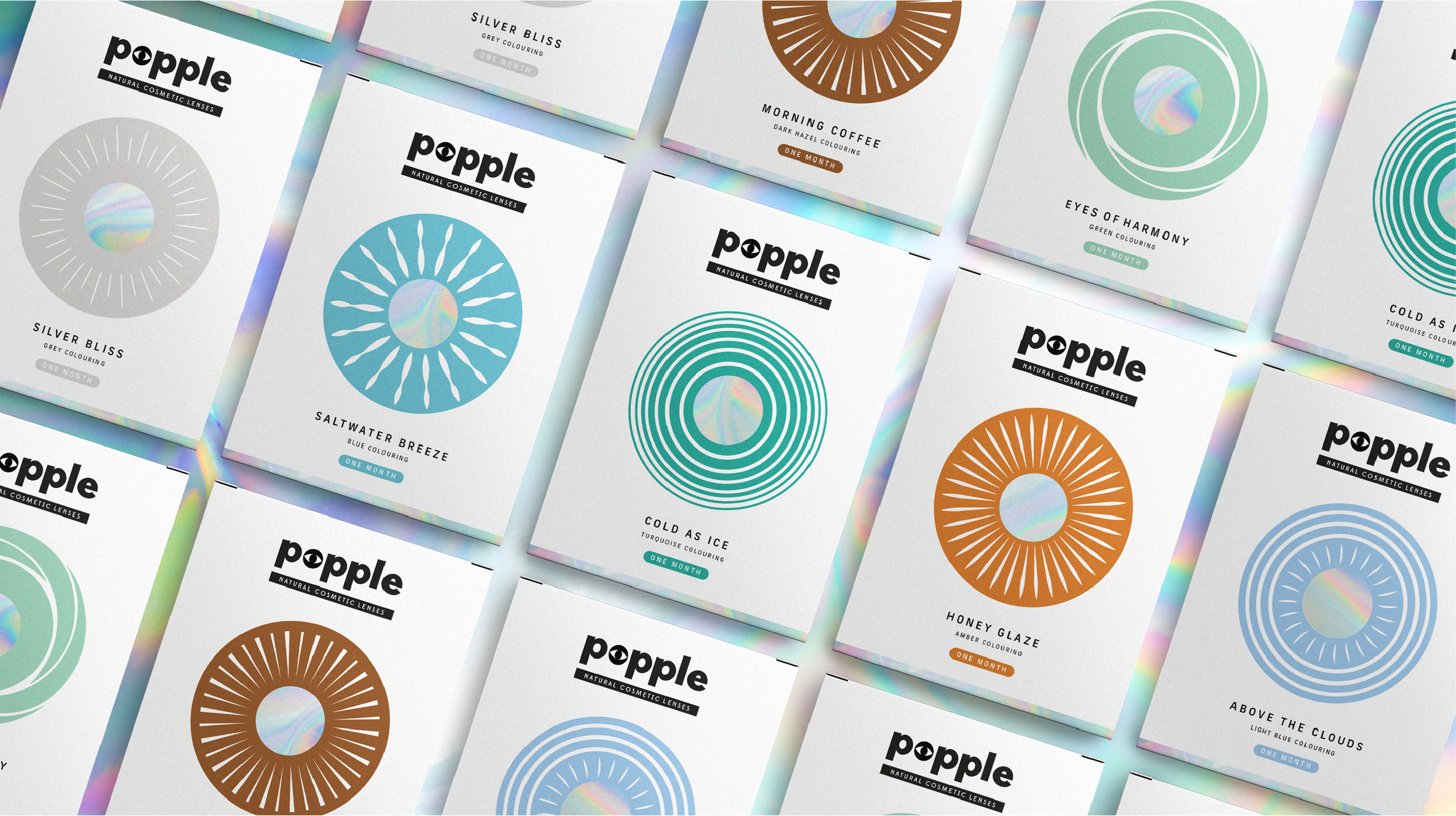
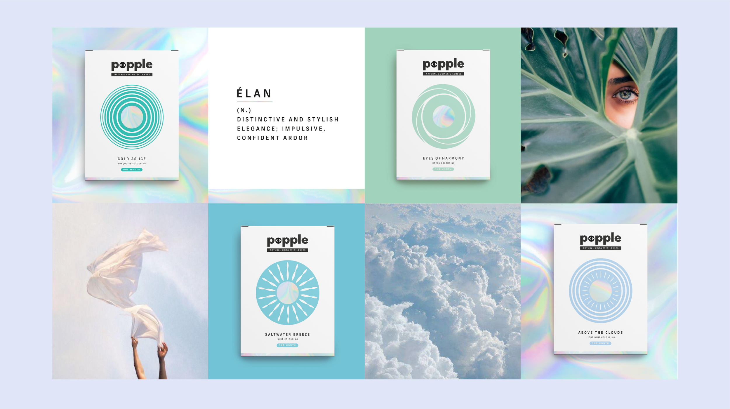
We created Popple—a name rooted in nature, inspired by the “tree eyes” found on the Populus Aspen tree. It felt fresh, playful and quietly clever. From there, we built a brand world that puts the iris centre stage—owning the power of eye contact and the freedom of choice.
The visual identity balances beauty and nature with a hint of attitude. Bold colours, soft shapes and eye-catching typography all come together to help Popple stand out—while still feeling grounded and accessible.
The Transformation
We brought Popple to life across every touchpoint—from naming and brand identity to packaging and social.
A startup with no visual presence is now a confident, cohesive brand ready to enter the market with clarity and impact.